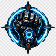
SPRAWL zero Logo Explained: Y2K Branding, Design Details, and Where to Find It
The SPRAWL zero logo anchors the game's Y2K identity. Explore its design language, official asset sources, and tips for thumbnails, videos, and fan projects.
The SPRAWL zero logo is doing more work than most players realize. Before a single Gravity Glove fires, that wordmark has to convince someone scrolling a storefront that a 2000s-era console shooter revival is worth $19.99 — and it has roughly half a second to do it. That is why the branding matters: in a market crowded with retro revivals, the SPRAWL zero logo is the handshake between MAETH's brutalist cyberpunk city and your memory of the Y2K golden age.
SPRAWL zero Logo: The Quick Facts Behind the Branding
Before digging into typography and asset sourcing, it helps to anchor the basics. Everything below comes from the game's official storefront listings and its verified social channels.
| Detail | Information |
|---|---|
| Game | SPRAWL zero |
| Developer | MAETH |
| Publisher | Kwalee |
| Release date | September 8, 2026 |
| Platforms | PC (Steam and Epic Store), Steam Deck, PS5, Xbox Series X/S, Nintendo Switch 2 |
| Standard price | $24.99 (launch offer brought it to $19.99) |
| Steam reception | Very Positive — check the live Steam listing for current share and count |
| PlayStation player rating | Check the live listing; rating and count change over time |
| Genre tags | FPS, Boomer Shooter, Cyberpunk, Bullet Time, Retro |
Those numbers matter for branding analysis because they show how the logo performs in a crowded storefront. Steam is strongly positive, while the PlayStation rating changes over time; check the live listing before making a current comparison.
What the SPRAWL zero Logo Says Before You Press Play
The game's own store copy is blunt about its ambitions: SPRAWL zero is "a fast-paced shooter inspired by the Golden Age of 2000s FPS," built with "authentic Y2K aesthetics and graphics, paying homage to the golden era." The branding follows the same brief. This is a prequel to MAETH's 2023 release SPRAWL, and the title treatment signals that relationship immediately — a familiar franchise name plus a qualifier that tells you this is the earlier chapter.
That is a smart piece of design logic. Longtime fans of the original recognize the family resemblance. Newcomers read "zero" as a starting point, which lowers the barrier to entry for anyone who missed the first game. One word does both jobs.
Where the mark appears also shapes how players read it. It shows up in a handful of consistent places, and each one frames the game slightly differently.
| Branding touchpoint | Where it appears | What it communicates |
|---|---|---|
| Store capsule and header art | Steam and PlayStation Store listings | The core promise: gritty, fast, retro-futuristic |
| Launch trailer title card | Gameplay launch trailer | Motion and impact — the mark as an event, not a label |
| Official X profile banner | @SPRAWLfps account | Community-facing identity, updated with release status |
| Deluxe Edition and soundtrack art | Steam DLC listings | Collector appeal and franchise world-building |
| In-game level title cards | During gameplay | Diegetic branding — community reports note Halo-style level titles at the bottom of the screen |
That last row is the most interesting. When a game carries its title treatment into the HUD and level intros, the logo stops being marketing and becomes part of the fiction. Player experience reports consistently highlight this as one of the ways SPRAWL zero builds atmosphere without long exposition dumps.
Design Language: Why a Y2K Wordmark Still Works in 2026
The Y2K revival is not nostalgia for nostalgia's sake. It is a reaction against a decade of minimal, flat, system-font branding. The era MAETH is referencing was loud — metallic gradients, sharp angular type, interface-inspired framing, and a willingness to look slightly unpolished because the technology was still catching up to the ambition.
SPRAWL zero's branding sits squarely in that lineage. The wordmark pairs an all-caps franchise name with a smaller lowercase qualifier, a structure that reads as both a logo and a file name — very much in keeping with a game about a cybernetically enhanced supersoldier designated FIVE operating inside a collapsing military state.
| Y2K design convention | Why it still lands with modern players |
|---|---|
| All-caps display type with a lowercase modifier | Instantly reads as early-2000s software and console packaging |
| High-contrast, saturated accent color | Survives being scaled down to a 300px storefront tile |
| Interface and HUD-inspired framing | Ties the marketing art to actual in-game UI |
| Slight grunge or texture overlay | Signals grit and violence rather than clean corporate polish |
| Simple, two-word structure | Legible in thumbnails, sidebars, and mobile search results |
Notice the last row. Whatever artistic choices MAETH made, the mark is short. "SPRAWL zero" is ten letters plus a space. That is a branding advantage that no amount of art direction can buy, and it is a big reason the game is easy to spot in a crowded Steam queue.
Where to Find Official SPRAWL zero Logo Assets
If you write about games, make videos, or run a fan page, sourcing the mark from the right place matters — both for accuracy and for staying on the right side of the developer's wishes. MAETH has not published a standalone brand kit, so the safest approach is to pull from official storefronts and the verified social account.
| Source | What you'll find | Best use |
|---|---|---|
| Official SPRAWL zero Steam page | Capsule art, header image, screenshots, trailer thumbnails | Article embeds, video overlays, accurate reference |
| PlayStation Store concept page | PS5 tile art, rating badges, ESRB information | Console-focused coverage and comparisons |
| Official SPRAWL zero X account | Profile banner, release announcements, short weapon clips | Tracking brand updates and new key art |
A practical tip: grab the header image at full resolution rather than screenshotting a store tile. The Steam header is designed to be cropped and scaled, so it holds up better in a 1280x720 thumbnail than a stretched capsule does.
Also worth noting — the official X account uses "SPRAWL zero | OUT NOW!" as its display name. That is a small but useful signal about how the team wants the name styled: sentence case for the qualifier, capital letters for the franchise. Match that and your coverage looks professional.
Putting the SPRAWL zero Logo to Work: Practical Tips
Whether you are building a thumbnail, a review graphic, or a wiki entry, a few rules keep the branding readable and respectful of the source art.
- Keep clear space around the mark. Y2K-era logos were designed to sit inside interface frames, so they need breathing room to read correctly.
- Never recolor the wordmark. The palette is part of the identity; a hue-shifted logo looks fan-made in the worst way.
- Pair it with gameplay, not just art. The mark sells a promise, and screenshots of Gravity Shield deflections or Bullet-Time kills deliver on it.
- Scale down before you commit. Shrink your design to 320px wide and check whether the title is still legible.
- Credit the developer. MAETH and publisher Kwalee are the rights holders; a one-line credit costs nothing.
| Content goal | Recommended approach | Why it works |
|---|---|---|
| YouTube thumbnail | Logo on one side, action screenshot on the other | Preserves the 50/50 split viewers scan for |
| Written review header | Header art with the logo untouched | Matches official presentation, avoids distortion |
| Comparison graphic | Logo next to the 2023 SPRAWL mark | Highlights the prequel relationship visually |
| Social post | Logo plus a single stat or quote | Gives scrollers a reason to stop |
Player Experience and Community Reaction to the Branding
Community reports suggest the Y2K pitch landed. A widely shared YouTube review called SPRAWL zero "a peak Y2K throwback" and went as far as naming it a Y2K game of the year contender, praising how the game channels the era's design sensibility rather than just its color palette. The same reviewer noted the soundtrack — credited in that coverage to Carlos Lizarraga, the studio director performing as REVEL — as a standout element of the presentation.
Player experience on Steam backs that up with volume rather than vibes: 94% positive on the live Steam listing, with popular user tags including Boomer Shooter, Cyberpunk, Bullet Time, and Retro. On PlayStation, the five-star share is dynamic and should be checked on the live listing.
Not everything is unanimous. The same community coverage flags one mid-game level, "Adusta Terra," as a tedious low point involving poisonous gas and drawn-out pacing. That is a gameplay critique, not a branding one — but it is a useful reminder that a strong logo gets players in the door and only the game keeps them there.
FAQ
Is the SPRAWL zero logo available as a transparent PNG? MAETH has not published a standalone brand kit with transparent files. The cleanest sources are the official Steam page header and the PlayStation Store tile. If you need a transparent version, extract the mark from a high-resolution official image rather than recreating it by hand, since hand-traced versions rarely match the original letterforms.
Does the "zero" in the SPRAWL zero logo mean it is a prequel? Yes — the game is positioned as a prequel to MAETH's 2023 release SPRAWL. The "zero" qualifier signals an origin chapter, which is why the SPRAWL zero logo keeps the franchise name front and center while differentiating the entry.
Can I use the SPRAWL zero logo in my own video or article? Editorial and review use is standard practice, and the mark appears across official storefronts for exactly that kind of reference. Keep it unmodified, avoid implying official endorsement, and credit MAETH and Kwalee as the rights holders.
Where should I check first for updated logo art? Start with the official Steam page, since storefront art is updated whenever a major patch, DLC drop, or bundle launches. The official X account is the fastest source for fresh key art between storefront updates — the team posts weapon showcases and release news there regularly.
What makes the SPRAWL zero logo work as a Y2K design? It is short, high-contrast, and structured like early-2000s software branding: an all-caps franchise name with a lowercase qualifier. That combination stays legible at thumbnail size while still signaling the era the game is deliberately recreating.
Related Guides
SPRAWL zero Announcement Trailer: Full Breakdown of Every Trailer Released
The SPRAWL zero announcement trailer debuted at IGN Fan Fest 2026. Here's every trailer, the release date, platforms, price, and what launch reviews say.
SPRAWL zero Cover Art Explained: Where to Find Every Official Image and Asset
A complete guide to the SPRAWL zero cover: where official key art, screenshots, and art book pages live, plus how the Y2K look was built.
SPRAWL zero OST: Full Track List, Release Date, Price, and Where to Listen
Everything we know about the SPRAWL zero OST: all 17 tracks, the REVEL composer credits, the $4.99 price, the Deluxe bundle, and how to listen.
SPRAWL zero Soundtrack Guide: Track List, Release Date & Where to Listen
The SPRAWL zero soundtrack by REVEL is out now. Full 17-track list, release date, bonus tracks, and where to stream the SPRAWL zero OST.